Note: Due to the wide max content width defined for this theme, there is CSS included that allows for a wide image but narrow content in the default single post layout (better for readability). The CSS in the Custom HTML block below overrides the aforementioned CSS so this template can be used with a sidebar and the content width expands to use the full space defined in the row’s Content Max Width setting.
You can delete this note, but if you wish to retain the layout as provided, do not delete the Custom HTML block below. That block and this note do not show on the front end.
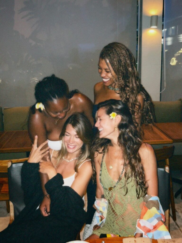
By babesengaged

Summer might think it owns weddings and parties, but fall is over here quietly being the main character. The leaves are showing off and suddenly cider tastes better than champagne (well, almost). If your bachelorette happens to land in this golden stretch of the year, you’ve basically been handed a built-in vibe.
And the best part? A fall bachelorette doesn’t feel like a carbon copy of the last dozen parties you’ve seen on Instagram. It’s warmer, cozier, and a little quirkier. It can be heartfelt one minute and spooky the next. It gives you permission to lean into the season and call it the theme.
So let’s talk about locations that set the scene, how to pull the details together, and eight fall bachelorette party ideas that will make you want to text your group chat immediately.
Why Fall Bachelorettes Are Kind of Genius
Summer bachelorettes are fun, but they come with sunburns and crowded hotels. Fall avoids all that. You get cooler nights, space to breathe, and settings that feel like they belong in a rom-com.
Picture this: a group photo at golden hour when the leaves look like they’re on fire, laughter around a firepit with mugs of something warm, a playlist full of nostalgic throwbacks that sound even better when you’re wrapped in a blanket. You don’t have to work hard to make it memorable — fall kind of does it for you.
Where to Go
The spot you pick sets the mood before you’ve even unpacked the champagne. A few ideas to spark inspiration:
- Cabins in the woods. A crackling fireplace and maybe a hot tub on the porch. Enough said.
- Wineries and cider houses. Built-in activities (read: wine tastings) with a backdrop that does all the work.
- Airbnbs with personality. A farmhouse, a city loft, a chic cottage — the right space can double as décor.
- Orchards and farms. Bonus points for pumpkin patches and photo ops that basically stage themselves.
- City escapes. Rooftop bars, cozy breweries, boutique hotels. Fall works just as well in an urban setting.
Pick the vibe that feels most like your bride. Outdoorsy, foodie, glam, low-key — Fall has a backdrop for all of it.
of 8
Apple of Her Eye
Start the day at a local orchard: matching flannels, baskets in hand, someone inevitably trying to climb a tree for the “perfect apple.” Later, cider tasting and caramel apple bites turn into a table that looks like Martha Stewart styled it except it’s really just crates, gingham, and apples in every shade.
It’s rustic, wholesome, and photogenic. The kind of theme where you wonder why you don’t do this every fall, bride or not.
Quick Tips:
✦ Matching flannels = group photos that live on forever.
✦ Apple cider mimosas need fun names (think “Golden Hour” or “Berry in Love”).
✦ Crates of apples? Cheaper than flowers and just as cute.
of 8
Falling for Her [New Last Name]
The pun writes itself, but it’s cute every single time. Think garlands of leaves, jewel-toned candles, blankets thrown over chairs, and the bride’s new name popping up everywhere — on mugs, signs, even cheeky sweatshirts if you’re feeling extra.
The night ends around a firepit, everyone tucking into hot toddies, roasting marshmallows, and laughing about old stories that get more dramatic with each retelling. It’s cozy, it’s romantic, and someone will absolutely say, “This feels like a movie.”
Quick Tips:
✦ Blankets double as favors and keep everyone warm.
✦ Personalized touches with her name = instant sentiment.
✦ Firepit = guaranteed bonding moment.
of 8
Fall in Love
If your bride is into romance and swooning over fairy lights, this theme is her sweet spot. A backyard or Airbnb turns into a glowing wonderland with string lights, plaid throws, mini pumpkins, and dried flowers that she’ll want to keep.
The night flows easy: candle-making, pumpkin painting, a little wine and cheese, maybe even a projector movie under the stars. It’s less “wild night out” and more “let’s savor this together.” A vibe, in other words.
Quick Tips:
✦ Dried flowers = décor she can keep
✦ Mulled wine instantly feels fancy (and smells amazing).
✦ A projector turns any backyard into a movie night.
of 8
She’s Off the Market
Farmers’ market, but make it a party. Think crates of produce, mason jars, sunflowers, and a grazing table piled with bread, cheese, and jam. The drinks? Cider, obviously, with maybe a splash of red wine for good measure.
Set up a DIY bouquet bar or hand out custom totes that say “Off the Market.” It’s playful, charming, and everyone secretly loves the pun.
Quick Tips:
✦ Fresh produce = décor you can snack on.
✦ Custom totes = favors people actually use.
✦ An outdoor setup makes the market vibe sing.
of 8
Flannel and Fizz
This one’s basically the best sleepover you’ve ever had, but with champagne. Everyone in matching flannel PJs, prosecco with endless mixers, and comfort food that makes people happy before they even sit down.
It’s laid-back, funny, and ends with group photos of everyone doubled over laughing in plaid. The kind of night that feels effortless but becomes the one everyone talks about.
Quick Tips:
✦ Matching pajamas = hilarious photos
✦ Comfort food > fancy menus every time.
✦ A bubbly bar keeps things interactive.
of 8
Last Boo Before I Do
Halloween fans, this is your moment. Cobwebs, moody lighting, metallic pumpkins, and a playlist that swings from “Monster Mash” to throwback anthems. Drinks get spooky names — “Love Potion,” “Boo-zy Sangria” — and costumes are mandatory.
Add a costume contest, a haunted house visit, or even old-school apple bobbing, and you’ve got a night that’s part silly, part stylish, and entirely memorable.
Quick Tips:
✦ A fog machine adds instant atmosphere.
✦ Costume contests make for the funniest photos.
✦ Lean into themed cocktails — the cheesier the name, the better.
of 8
Mrs. to Miss with My Witches
Gather your coven. Everyone in black, candles everywhere, crystals on the table, and a “potion bar” where the mixers sparkle and glow. It’s witchy, but glam.
Activities seal the deal: tarot readings, aura photography, or a moon circle where everyone shares wishes for the bride’s next chapter. Emotional, magical, and the kind of night you don’t forget.
Quick Tips:
✦ Candles + crystals = instant mood.
✦ A potion bar doubles as entertainment.
✦ Add a witchy playlist for perfect background vibes.
of 8
Till Death Do Us Party
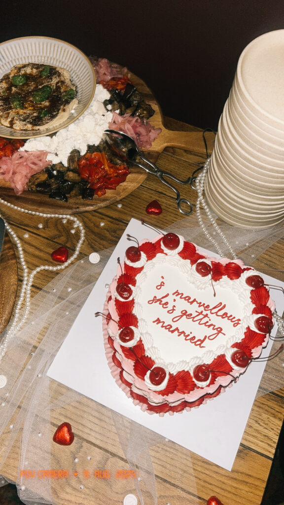
For the bride who loves a little drama. Picture black lace, deep burgundy flowers, and drinks as dark as the décor. Guests show up in jewel tones, bold lipstick, and smoky eyes. A blood-red velvet cake with black roses sits in the middle of it all, daring you not to Instagram it.
It’s moody, glamorous, and just the right amount of edgy. A theme that feels theatrical in the best way.
Quick Tips:
✦ Bold makeup makes the photos unforgettable.
✦ A dramatic cake sets the mood on its own.
✦ Jewel tones make the group look effortlessly coordinated.
Wrapping It Up
Here’s the thing: summer might hog the spotlight, but fall bachelorette parties? They’re the ones you end up talking about for years. They feel different. They feel cozy, playful, and sometimes a little spooky in the best way.
Whether you’re apple-picking in flannels, sipping prosecco in plaid pajamas, or channeling your inner witch under candlelight, the magic of a fall bachelorette is how personal it feels. You don’t need a packed itinerary or a huge budget. Just the right theme, a few thoughtful details, and space for those ridiculous, wonderful moments with your favorite people.

Recent Highlights


Don’t Miss the Next Big Story
Join thousands of readers who never miss a headline.